
...and why I've decided to abandon the hyper-curated tight 10 image portfolio.
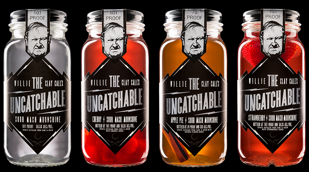
The bottle cap image is something that was the result of some fun 'what-if' experimenting in the studio late one evening... and I somehow felt compelled to add it to my portfolio. At the time, one of the few images in my portfolio that were not 'commercial' in nature.
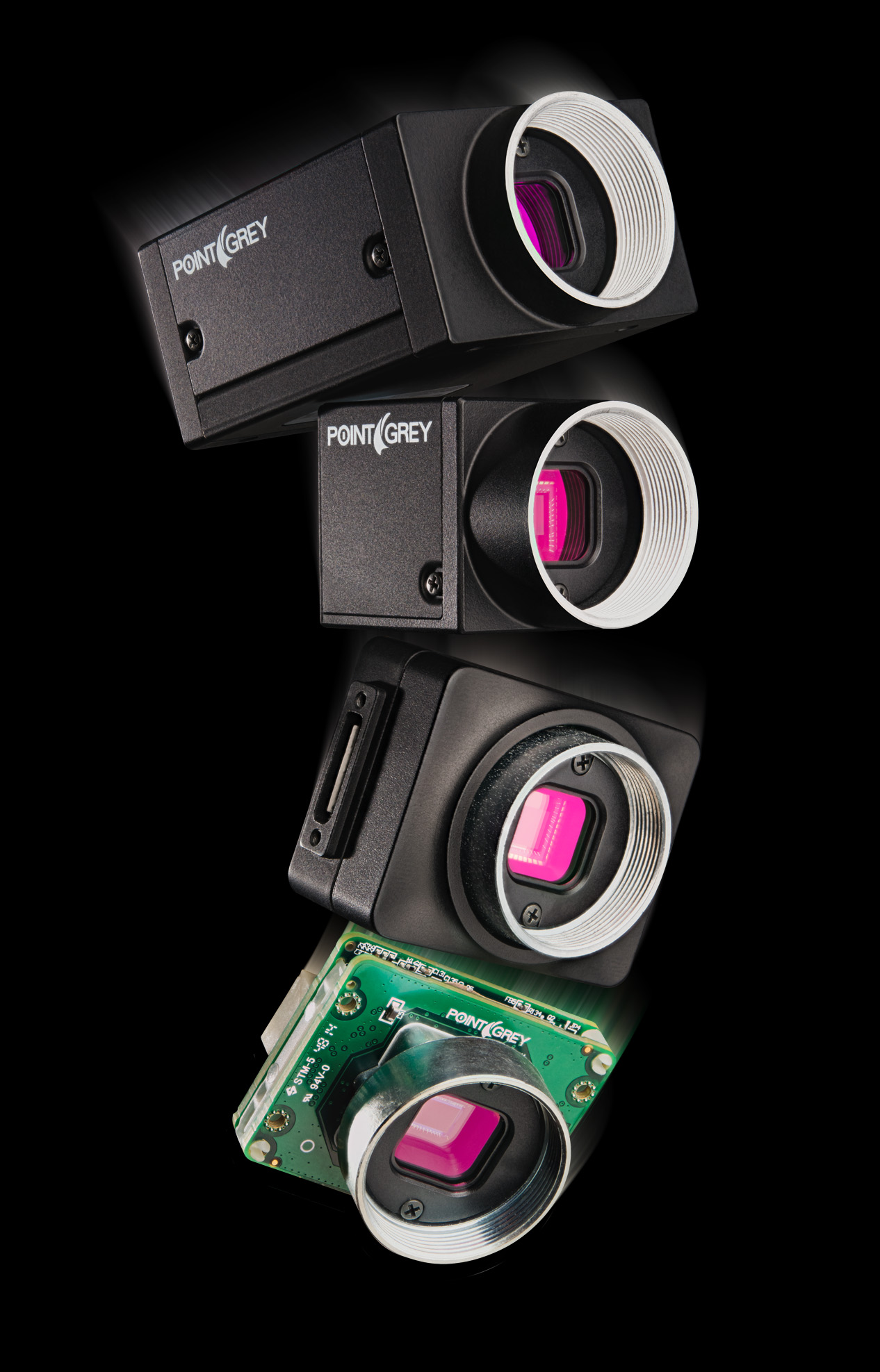
The falling cameras at right, are the results from a client that was inspired by the bottle-cap image enough to reach out and say.. can you do something like that.. but with cameras?
So there's the rub - you never know what might connect with someone.
I've expanded the categories, started sharing more images in each category, and this blog will expand on those further. There's also a link to my 'Filmstagram' - which is my Instagram feed dedicated to film only. It's a good honest look at my community, friends, family. Maybe through what you see, you can get to know me a little!
I'll follow up with a post about the camera shoot below - it's a good one.

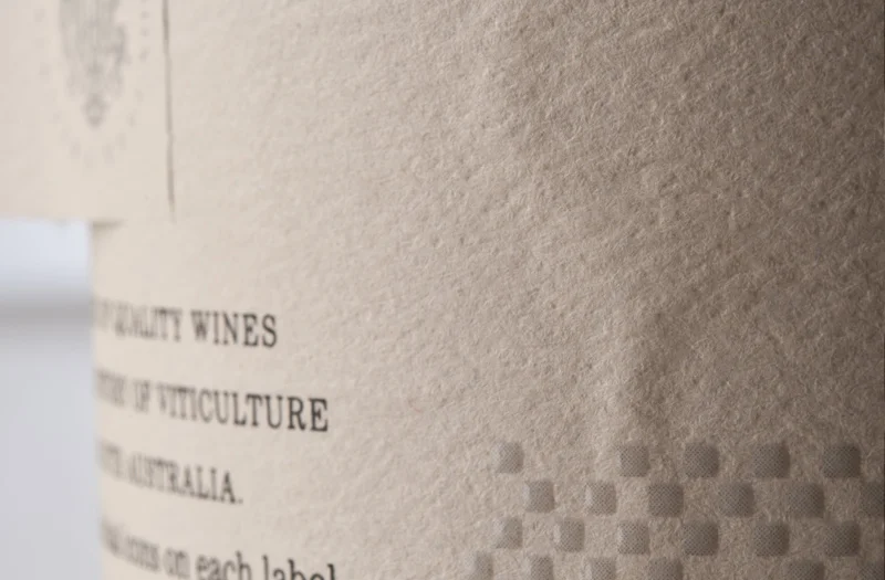
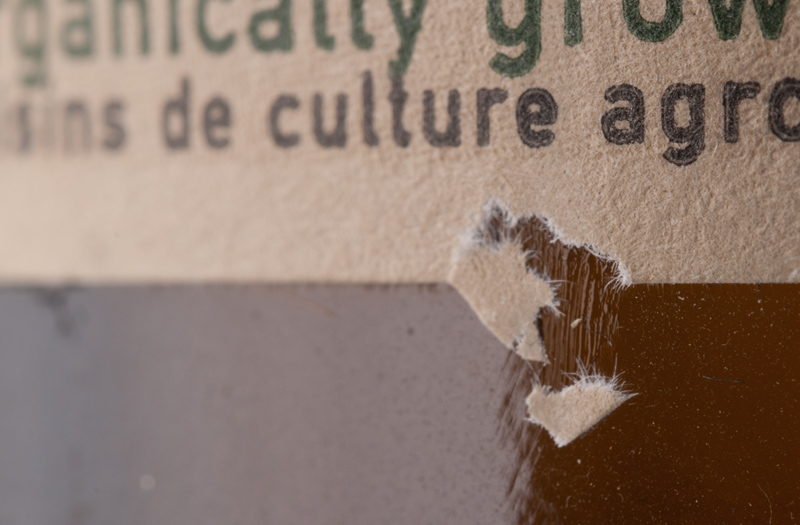
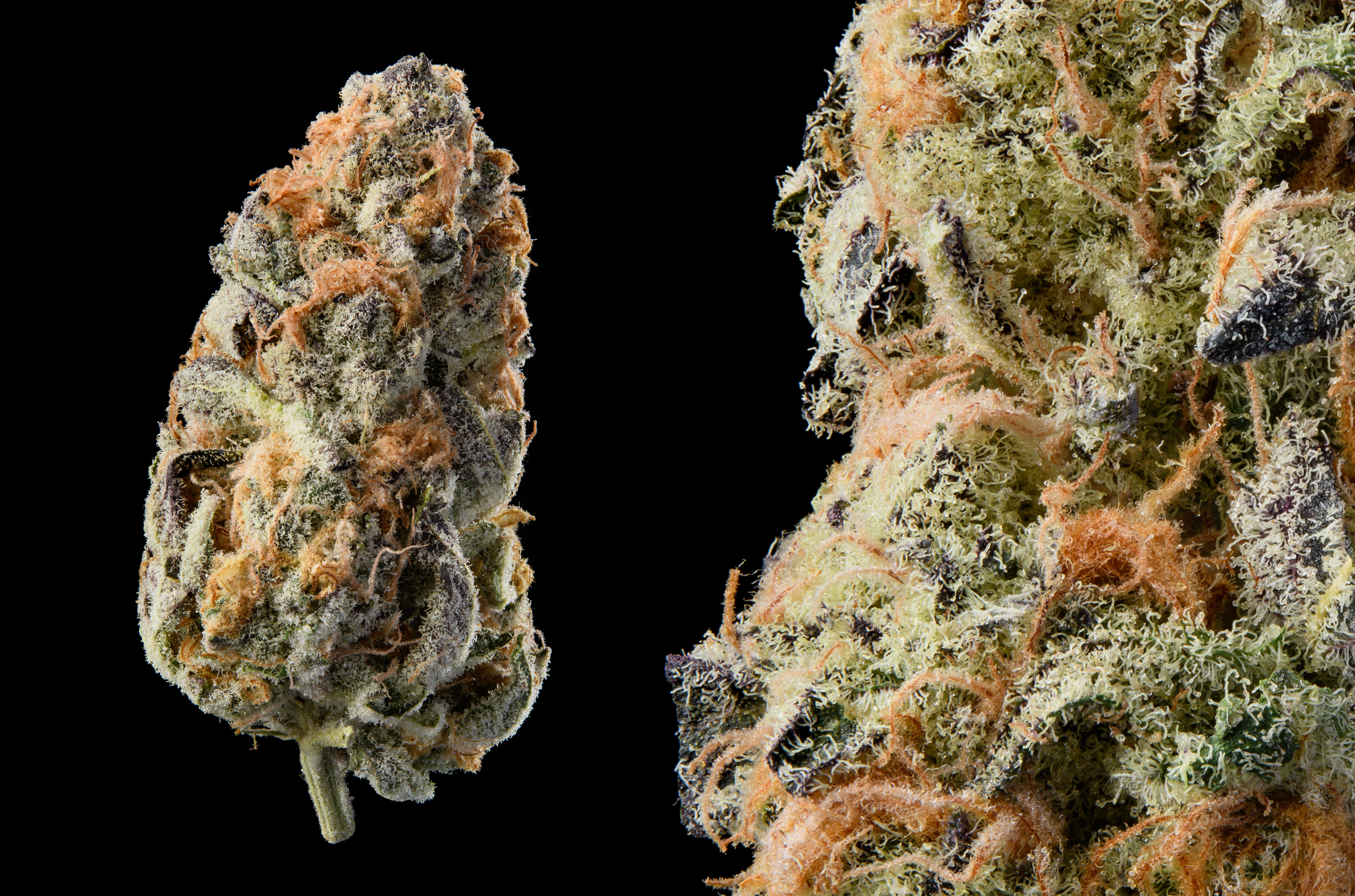
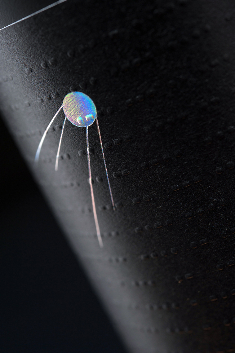
Macro work used on website